

パソ君
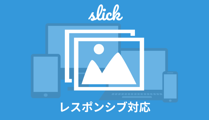
・slickでレスポンシブ対応する方法は?
こんな疑問にお答えします。
デザインカンプによっては、スマホとPCでスライダーの枚数などが違うことありますよね。
ただ大丈夫。
slickでは簡単にレスポンシブ対応することができちゃいます。

ジト
すぐにできるよ!
ということで、この記事では「slickのレスポンシブ対応方法」について解説していきます!
この記事でわかること
slickのレスポンシブ対応方法
 【jQuery】slickの使い方|初心者向けに解説【レスポンシブ対応】
 【簡単】slickのレスポンシブ対応方法【ブレイクポイント】
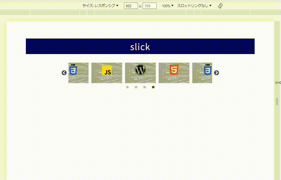
そんなレスポンシブ対応したスライダーのサンプルがこちら↓
See the Pen slickブレイクポイント➀ by jito-coder (@jito-coder) on CodePen.
「HTML」や「CSS」のボタンをクリックしてみてください。見た目が変わります。
- PC時 ⇒3枚表示の中央配置、矢印あり
- 横幅640px以下⇒1枚表示の中央配置、矢印なし
そんな実装をしたコードがこちら↓
$(function () {
    $(".test-slick").slick({
        autoplay: true,
        dots: true,
        centerMode: true,
        centerPadding: "15%",
        slidesToShow: 3,
        responsive: [
            {
            breakpoint: 640,
                settings: {
                    arrows: false,
                    slidesToShow: 1,
                    centerPadding: "10%",
                },
            },
        ],
    });
});
8~17行目にてレスポンシブ対応をしています。
「responsive」を使って、「breakpoint」部分に数値を指定することで、レスポンシブ対応ができます。
responsive: [
    {
    // 横幅の数値を指定。今回は640px以下の場合。
    breakpoint: 640,
        settings: {
            // 変えたいオプションを指定。
            arrows: false,
            slidesToShow: 1,
            centerPadding: "10%",
        },
    },
],
今回の例だと「横幅640以下だったら表示枚数を1枚に、矢印を無効化に、paddingを10%に」という指定になります。
これだけで簡単にレスポンシブ対応ができちゃいます。
複数のブレイクポイントを設置可能
ちなみにブレイクポイントは複数指定可能です。
こんな感じで↓
$(function () {
    $(".test-slick").slick({
        autoplay: true,
        dots: true,
        centerMode: true,
        centerPadding: "15%",
        slidesToShow: 3,
        responsive: [
            {
            breakpoint: 768,
                settings: {
                    slidesToShow: 2,
                    centerPadding: "13%",
                },
            },
            {
            breakpoint: 640,
                settings: {
                    arrows: false,
                    slidesToShow: 1,
                    centerPadding: "10%",
                },
            },
            {
            breakpoint: 375,
                settings: {
                    arrows: false,
                    slidesToShow: 1,
                    centerMode: false,
                },
            },
        ],
    });
});
See the Pen slickブレイクポイント➁ by jito-coder (@jito-coder) on CodePen.
【簡単】slickのレスポンシブ対応方法【ブレイクポイント】:まとめ
- 「responsive」を使ってレスポンシブ対応を実装
- 「breakpoint」部分の数値でブレイクポイントを指定
- ブレイクポイントは複数指定可能
ジト
slickにてレスポンシブ対応をするときは試してみてね!
 【解説】slickのオプション一覧【カスタマイズまとめ】
  【最新】slickのスライダー実装サンプル25選【コピペOK】