 Matsu Code
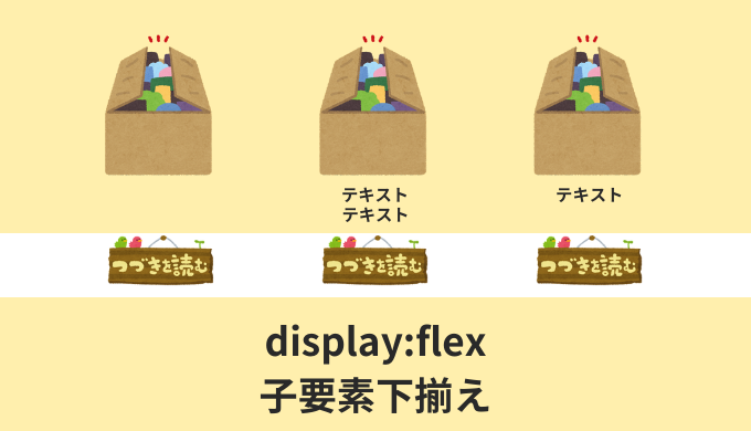

・display: flex;で子要素やボタンを下揃えするにはどう実装するの?
こんな疑問にお答えします。
Flexboxを使ったとき、子要素やボタンの位置がそれぞれズレてしまいますよね。
下記画像みたいに↓
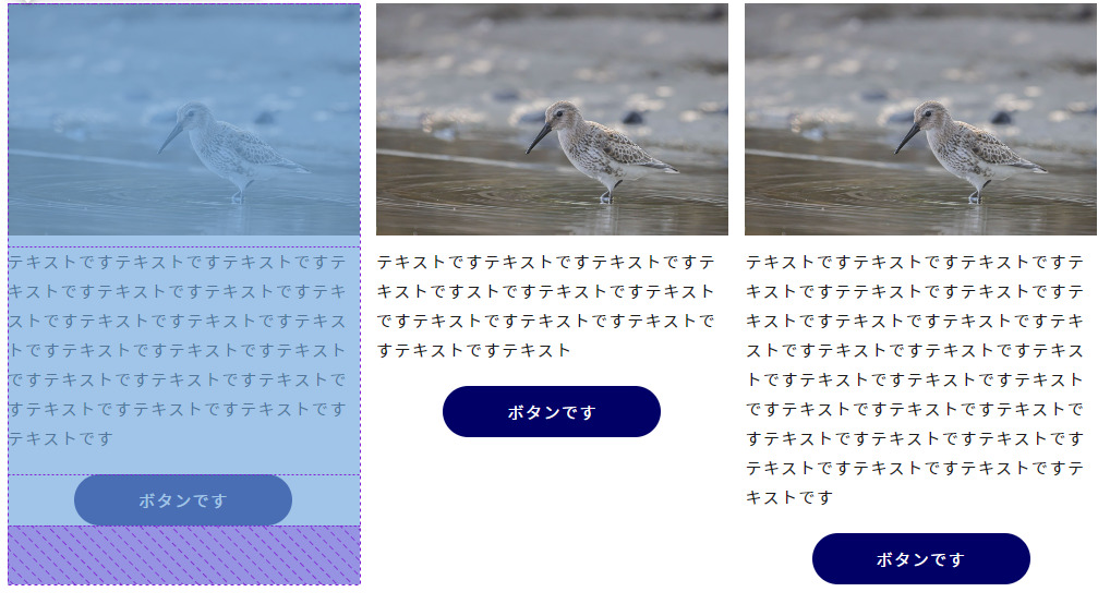
ボタンの位置がバラバラで、見栄えがよくありません。デザインカンプがこの通りなら良いのですが。
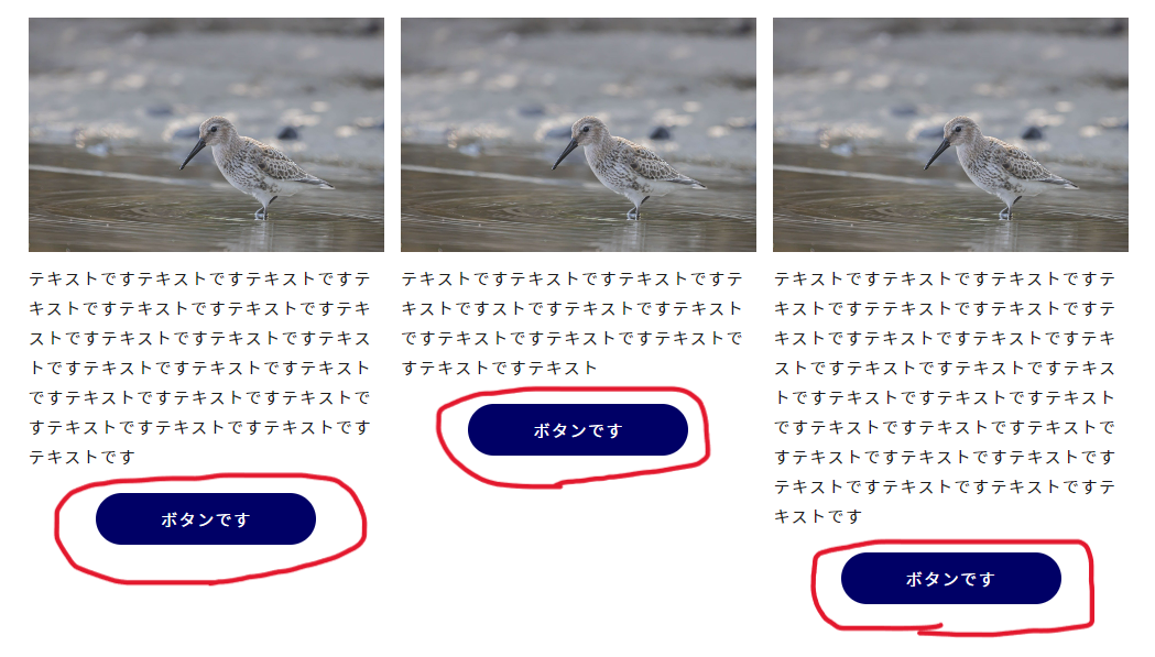
実際はこのようにしたいはず↓
こんな感じに、ボタンの位置を横一列そろえたいですよね。見栄えがよいですから。
実はこの実装、簡単にできちゃいます。

すぐできるよ!
ということで、この記事では「display: flex;で子要素やボタンを下揃えする裏技」について解説していきます!
・display: flex;で子要素やボタンを下揃えする裏技
目次
【CSS】display: flex;で子要素やボタンを下揃えする裏技【Flexbox】
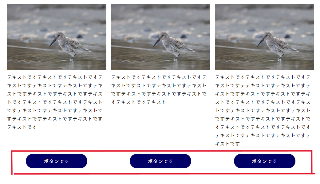
まず実際のサンプルを見てみましょう。
それがこちら↓
See the Pen Untitled by matsu-code (@matsu-code) on CodePen.
<div class="flex">
    <div class="flex-item">
        <div class="flex-item__img"><img src="./assets/img/test01.jpg" alt="" width="1280" height="843"></div>
        <p class="flex-item__text">テキストですテキストですテキストですテキストですテキストですテキストですテキストですテキストですテキストですテキストですテキストですテキストですテキストですテキストですテキストですテキストですテキストですテキストですテキストですテキストです</p>
        <a href="" class="flex-item__btn">ボタンです</a>
    </div>
    <div class="flex-item">
        <div class="flex-item__img"><img src="./assets/img/test01.jpg" alt="" width="1280" height="843"></div>
        <p class="flex-item__text">テキストですテキストですテキストですテキストですストですテキストですテキストですテキストですテキストですテキストですテキストですテキスト</p>
        <a href="" class="flex-item__btn">ボタンです</a>
    </div>
    <div class="flex-item">
        <div class="flex-item__img"><img src="./assets/img/test01.jpg" alt="" width="1280" height="843"></div>
        <p class="flex-item__text">テキストですテキストですテキストですテキストですテテキストですテキストですテキストですテキストですテキストですテキストですテキストですテキストですテキストですテキストですテキストですテキストですテキストですテキストですテキストですテキストですテキストですテキストですテキストですテキストですテキストですテキストです</p>
        <a href="" class="flex-item__btn">ボタンです</a>
    </div>
</div>
.flex {
display: flex;
justify-content: space-between;
}
.flex-item {
display: flex;
flex-direction: column;
width: calc((100% / 3) - 10px);
}
.flex-item__img {
margin-bottom: 10px;
}
.flex-item__text {
margin-bottom: 20px;
}
.flex-item__btn {
display: block;
text-align: center;
width: 100%;
max-width: 200px;
margin-right: auto;
margin-left: auto;
padding: 10px;
color: #fff;
background-color: #000066;
border-radius: 25px;
transition: opacity 0.3s ease;
margin-top: auto;
}
.flex-item__btn:hover {
text-decoration: none;
opacity: 0.7;
}ボタンの位置が下揃えになっていますよね!
たぶんサンプルを見ただけだとわかりにくいかと思うので、コードを解説していきます。
まず主に大事となるコードがこちらですね↓
.flex-item {
    display: flex;
    flex-direction: column;
    ~~~
}
.flex-item__btn {
    ~~~
    margin-top: auto;
}
つまりこういうこと↓
- 子要素に対して「display: flex;」「flex-direction: column;」を指定する
- 下揃えしたい要素に「margin-top: auto;」を指定する
順に見ていきましょう。
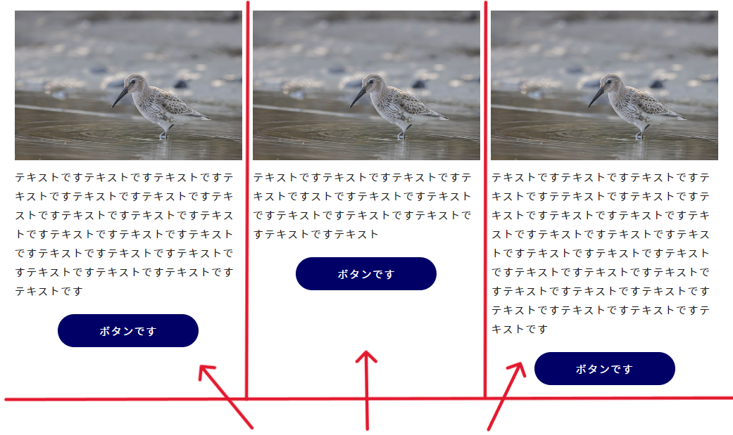
まずflexで横並びになっている子要素達に対して、さらに「display: flex;」を指定します。赤線の矢印要素に対してですね。
するとこうなります↓
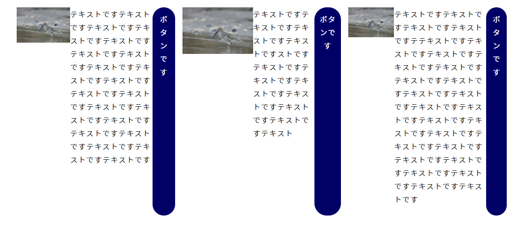
で、そこに「flex-direction: column;」を指定。縦並びにします。
するとこうなる↓
元のレイアウトに戻りましたね。
これをやる理由としては、次の「margin-top: auto;」を利用できるようにするため。
「margin-top: auto;」は「display: flex;」と「flex-direction: column;」を指定していないと、効いてくれないんですよね。
そのためにあえてここで横並び⇒縦並びをしています。
最後に「margin-top: auto;」を指定します。
これをやるおかげで、揃えたい要素が上方向に向かってmarginを効かせてくれるんですよ。
そのため一番下の位置まで要素が動きます。
つまり下記のように↓
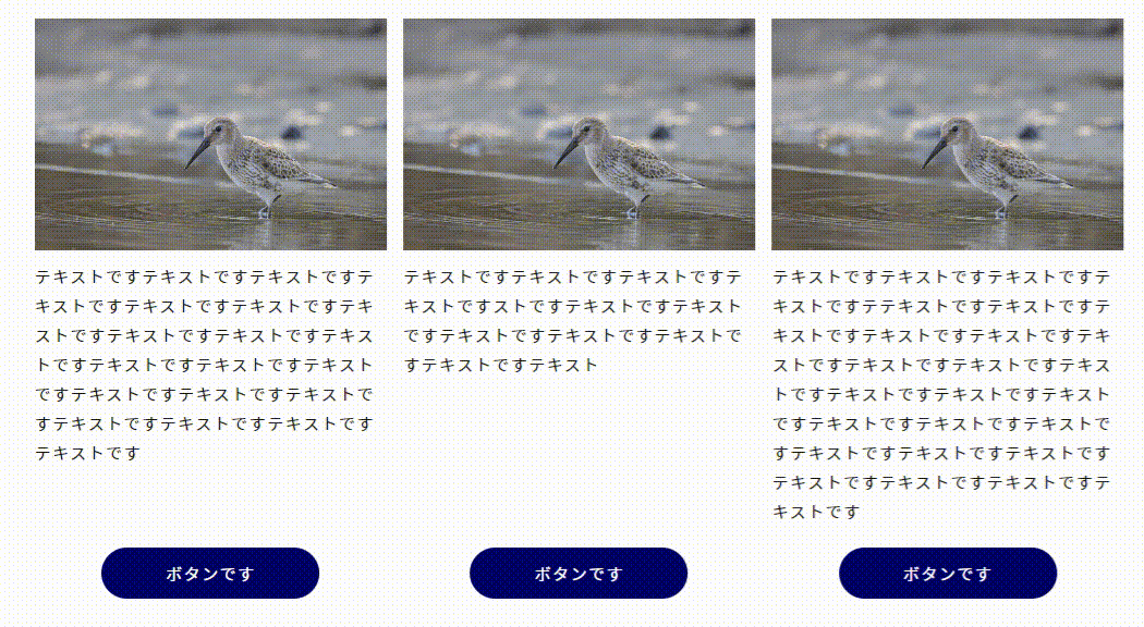
display: flex;で横並びにした要素達は、デフォルトで同じ縦の長さになります。それを活かして「margin-top: auto;」をすることで、同じ下位置まで動いてくれるということ。
これでボタンの位置を下揃えすることができました!
【CSS】display: flex;で子要素やボタンを下揃えする裏技【Flexbox】:まとめ
- 子要素に対して「display: flex;」「flex-direction: column;」を指定
- 指定する意味は「margin-top: auto;」を利用できるようにするため
- 下揃えしたい要素に「margin-top: auto;」を指定
仕組みさえわかってしまえば、すぐに実装できるよ!
flex系の他記事もどうぞ
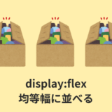 【CSS】Flexboxで均等幅に並べる3つの裏技【余白を調整】
 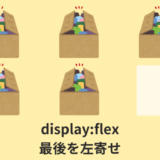 【解説】display:flex;で最後の子要素を左寄せする【justify-content】