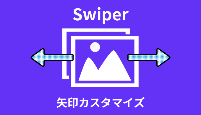


・Swiperの矢印ってカスタマイズできる?
こんな疑問にお答えします。
スライダーを作るとき、矢印のデザインがデフォルトではない場合ありますよね。
三角形だったり画像を使ったり。
実はSwiperなら、簡単に矢印のカスタマイズが可能です。

すぐにできるよ!
ということで、この記事では「Swiperの矢印カスタマイズ方法」について解説していきます!
swiper自体の作り方については下記記事を参考に↓
 【簡単】Swiperの使い方|初心者向けに解説【オプション】
 ・Swiperの矢印カスタマイズ方法【三角形】
・Swiperの矢印カスタマイズ方法【画像】
目次
【三角形】Swiperの矢印カスタマイズ方法【前へ・次へ】
まず三角形を使った矢印のカスタマイズ方法を紹介していきます。
そんなサンプルがこちら↓
See the Pen swiper 矢印カスタマイズ➀ by jito-coder (@jito-coder) on CodePen.
矢印が紺色の三角形になっていますよね。
<div class="swiper">
    <div class="swiper-wrapper">
        <div class="swiper-slide swiper-slide01">
            <img src="https://jito-site.com/wp-content/uploads/2023/01/1.png" alt="">
        </div>
        <div class="swiper-slide swiper-slide02">
            <img src="https://jito-site.com/wp-content/uploads/2023/01/2.png" alt="">
        </div>
        <!-- 省略 -->
    </div>
    <div class="swiper-pagination"></div>
    <div class="swiper-button-prev"></div>
    <div class="swiper-button-next"></div>
</div>
.swiper-button-prev::after,
.swiper-button-next::after {
content: "";
width: 0;
height: 0;
border-style: solid;
border-top: 12px solid transparent;
border-bottom: 12px solid transparent;
}
.swiper-button-prev::after {
border-right: 25px solid #000066;
border-left: 0;
}
.swiper-button-next::after {
border-left: 25px solid #000066;
border-right: 0;
}window.onload = function() {
const swiper = new Swiper(".swiper", {
spaceBetween: 20,
slidesPerView: 1,
loop: true,
pagination: {
el: ".swiper-pagination",
clickable: true,
},
navigation: {
nextEl: ".swiper-button-next",
prevEl: ".swiper-button-prev",
},
});
}コードの中で重要な点がこちら↓
- 通常通りのスライダーを実装
- 疑似要素の「content」を空白に
- 疑似要素にて三角形を実装
順に解説してきます。
まず通常通りのスライダーを実装するHTMLを組み立てます。
<div class="swiper">
<div class="swiper-wrapper">
<div class="swiper-slide swiper-slide01">
<img src="https://jito-site.com/wp-content/uploads/2023/01/1.png" alt="">
</div>
<div class="swiper-slide swiper-slide02">
<img src="https://jito-site.com/wp-content/uploads/2023/01/2.png" alt="">
</div>
<!-- 省略 -->
</div>
<div class="swiper-pagination"></div>
<div class="swiper-button-prev"></div>
<div class="swiper-button-next"></div>
</div>ここに関してはいつも通りでOKです。
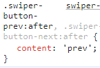
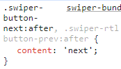
次にデフォルトで表示されている矢印を消します。
下記画像のように「content」に、「prev」と「next」が入っているのでCSSにて空白に指定しましょう。
.swiper-button-prev::after,
.swiper-button-next::after {
content: "";
}あとは三角形用のCSSを疑似要素に指定してあげれば完成です。
今回は例として下記のようなコードを記述しました。
.swiper-button-prev::after,
.swiper-button-next::after {
    content: "";
    width: 0;
    height: 0;
    border-style: solid;
    border-top: 12px solid transparent;
    border-bottom: 12px solid transparent;
}

.swiper-button-prev::after {
    border-right: 25px solid #000066;
    border-left: 0;
}

.swiper-button-next::after {
    border-left: 25px solid #000066;
    border-right: 0;
}ここはデザインに応じて調整しましょう!
【画像】Swiperの矢印カスタマイズ方法【前へ・次へ】
続いて矢印を画像にてカスタマイズする方法を紹介していきます。
そんなサンプルがこちら↓
See the Pen swiper 矢印カスタマイズ➁ by jito-coder (@jito-coder) on CodePen.
画像にて反映されていますよね。
といってもコードは先ほどとほぼ同じで、変えたのがCSSのみです。
<div class="swiper">
    <div class="swiper-wrapper">
        <div class="swiper-slide swiper-slide01">
            <img src="https://jito-site.com/wp-content/uploads/2023/01/1.png" alt="">
        </div>
        <div class="swiper-slide swiper-slide02">
            <img src="https://jito-site.com/wp-content/uploads/2023/01/2.png" alt="">
        </div>
        <!-- 省略 -->
    </div>
    <div class="swiper-pagination"></div>
    <div class="swiper-button-prev"></div>
    <div class="swiper-button-next"></div>
</div>.swiper-button-prev,
.swiper-button-next {
width: 70px;
height: 30px;
}
.swiper-button-prev::after,
.swiper-button-next::after {
content: "";
background-size: contain;
background-repeat: no-repeat;
width: 100%;
height: 100%;
}
.swiper-button-prev::after {
background-image: url(https://jito-site.com/wp-content/uploads/2023/06/arrow_s2.png);
}
.swiper-button-next::after {
background-image: url(https://jito-site.com/wp-content/uploads/2023/06/arrow_s.png);
}window.onload = function() {
const swiper = new Swiper(".swiper", {
spaceBetween: 20,
slidesPerView: 1,
loop: true,
pagination: {
el: ".swiper-pagination",
clickable: true,
},
navigation: {
nextEl: ".swiper-button-next",
prevEl: ".swiper-button-prev",
},
});
}コードの中で重要な点がこちら↓
- 矢印の高さと横幅を指定
- 疑似要素を使って背景画像を指定
順に解説してきます。
まず「前」と「次」の矢印の高さと横幅を指定してあげましょう。
これで画像の大きさを調整することができます。
.swiper-button-prev,
.swiper-button-next {
    width: 70px;
    height: 30px;
}
今回は横幅70px、高さ30pxと指定しました。デザインに合わせて調整しましょう。
あとは疑似要素に対して、背景画像を指定するだけです。
先ほどと同様に、「content」の中身を空白に。
そしてbackgroundプロパティを用いて、画像を反映してあげましょう。
.swiper-button-prev::after,
.swiper-button-next::after {
    content: "";
    background-size: contain;
    background-repeat: no-repeat;
    width: 100%;
    height: 100%;
}

.swiper-button-prev::after {
    background-image: url(https://jito-site.com/wp-content/uploads/2023/06/arrow_s2.png);
}

.swiper-button-next::after {
    background-image: url(https://jito-site.com/wp-content/uploads/2023/06/arrow_s.png);
}
これで画像を用いて、矢印をカスタマイズすることができました!
ちなみに矢印を枠外に出したい方は、下記記事を参考に↓
 【解決】Swiperで矢印とドットを外に出す方法【サンプルあり】
 【解説】Swiperの矢印カスタマイズ方法【前へ・次へ】:まとめ
- 疑似要素の「content」を空白に
- 疑似要素を用いて「三角形を作る」or「背景画像を指定」
Swiperの矢印をカスタマイズする時はためしてみてね!