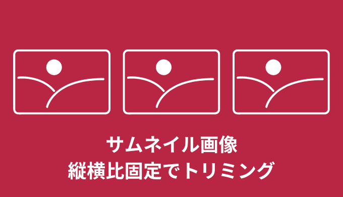


・サムネイル画像を縦横比固定でトリミングするにはどうやるの?
こんな疑問にお答えします。
ブログなどの記事部分に使うサムネイルって、縦横比固定でトリミングしたいですよね。
どんな画像の大きさを使っても良い感じにしたいはず。
実はそれCSSのみで簡単にできちゃいます。
すぐにできるよ!
ということで、この記事では「サムネイル画像を縦横比固定でトリミングする3つの方法」について解説していきます!
・サムネイル画像を縦横比固定でトリミングする3つの方法
・サムネイル画像を縦横比固定でトリミング【レスポンシブ対応】
目次
【CSSのみ】サムネイル画像を縦横比固定でトリミング【方法3選】
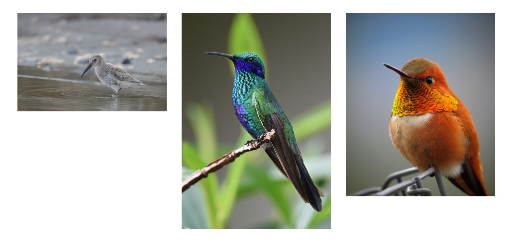
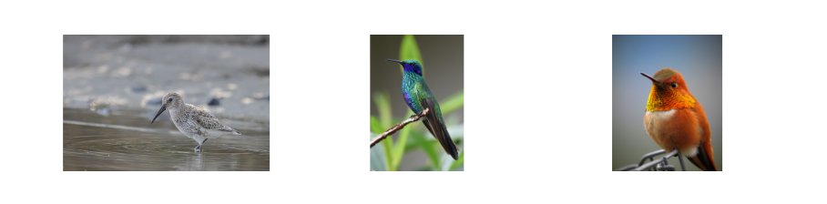
下記のようにバラバラの大きさの画像を今回は例として使用します。
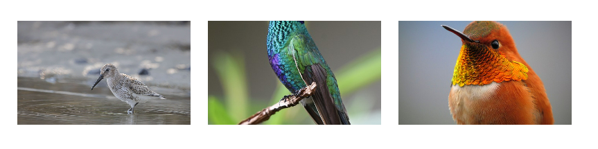
ブログなどのサムネイルで使いたい場合は、下記みたいに縦横比固定で良い感じにトリミングしたいですよね。
実はCSSのみで実装可能。
方法としては3つあります。
- 「object-fit」を使う
- 「background-image」を使う
- 「positionプロパティ」を使う
1つずつ見ていきましょう。
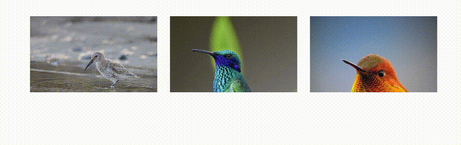
【方法①】サムネイル画像を縦横比固定でトリミング【object-fit】
1つ目がobject-fitを使った方法。
サンプルがこちらになります。(PCでの閲覧推奨)
See the Pen ➀サムネイルトリミング by jito-coder (@jito-coder) on CodePen.
トリミングされて良い感じになっていますよね。
<div class="thumbnail-01">
    <div class="thumbnail-01__img">
        <img src="https://jito-site.com/wp-content/uploads/2022/12/test01.jpg" alt="" width="1280" height="843">
    </div>
    <div class="thumbnail-01__img">
        <img src="https://jito-site.com/wp-content/uploads/2023/02/test02.jpg" alt="" width="441" height="640">
    </div>
    <div class="thumbnail-01__img">
        <img src="https://jito-site.com/wp-content/uploads/2023/02/test03.jpg" alt="" width="520" height="640">
    </div>
</div>
.thumbnail-01 {
display: flex;
justify-content: space-between;
max-width: 800px;
margin: 50px auto;
}
.thumbnail-01__img {
width: 250px;
height: 150px;
}
.thumbnail-01__img img {
width: 100%;
height: 100%;
object-fit: cover;
object-position: top;
}まずimgの親要素に対して、widthとheightを指定して大きさを設定しましょう。
<div class="thumbnail-01__img">
    <img src="" alt="" width="" height="">
</div>
.thumbnail-01__img {
width: 250px;
height: 150px;
}今回は横幅250px、縦幅150pxに指定しました。
次にimgタグに対してCSSを指定します。
やるとことは横幅100%、縦幅100%、object-fit: coverを記述するだけ。
.thumbnail-01__img img {
    width: 100%;
    height: 100%;
    object-fit: cover;
}
これでimgタグを囲む親要素の大きさ通りに、画像がトリミングされます。
object-fit: cover;とは、画像のアスペクト比を維持したまま画像を収めてくれるプロパティです。
ただIEには対応していないので注意。(対応したい場合はobject-fit-imagesを使う必要あり)
サムネの画像位置を変更したいなら「object-position」を使うのがオススメ。
object-position: top;良い感じの見栄えになりましたね!
【方法②】サムネイル画像を縦横比固定でトリミング【background-image】
2つ目の方法が「background-image」を使うこと。
サンプルがこちらになります。(PCでの閲覧推奨)
See the Pen ➁サムネイルトリミング by jito-coder (@jito-coder) on CodePen.
こちらは背景画像を使って、サムネイルを良い感じにトリミングしております!
<div class="thumbnail-02">
    <div class="thumbnail-02__img" style="background-image: url(https://jito-site.com/wp-content/uploads/2022/12/test01.jpg);"></div>
    <div class="thumbnail-02__img" style="background-image: url(https://jito-site.com/wp-content/uploads/2023/02/test02.jpg);"></div>
    <div class="thumbnail-02__img" style="background-image: url(https://jito-site.com/wp-content/uploads/2023/02/test03.jpg);"></div>
</div>
.thumbnail-02 {
display: flex;
justify-content: space-between;
max-width: 800px;
margin: 50px auto;
}
.thumbnail-02__img {
    width: 250px;
    height: 150px;
    background-repeat: no-repeat;
    background-position: center;
    background-size: cover;
}今回はWordPressのブログサムネイルを意識しているので、HTMLに対してsytleを記述して背景画像を指定しています。
<div class="thumbnail-02__img" style="background-image: url();"></div>これをphp化して、カスタムフィールドで出力すると考えたら下記みたいになります。
<div class="thumbnail-02__img" style="background-image:url(<?php the_field('hoge'); ?>)"></div>あとは背景画像に対しての大きさとトリミングをすれば、良い感じのサムネイル実装ができちゃいます。
コードがこちら。
.thumbnail-02__img {
width: 250px;
height: 150px;
background-repeat: no-repeat;
background-position: center;
background-size: cover;
}これに関しては方法①とほぼ同じ。
横幅250px、縦幅150px、リピートなし、位置は中央に、アスペクト比を保ったまま画像を収める。
これで背景画像を使って縦横比トリミングのサムネイルができました!
サムネの画像位置を変更したいなら「background-position」を変更しましょう。
background-position: top;良い感じの見栄えになりましたね!
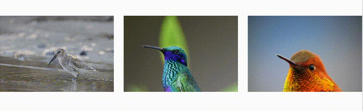
【方法➂】サムネイル画像を縦横比固定でトリミング【positionプロパティ】
3つ目の方法が「positionプロパティ」を使うこと。
サンプルがこちらになります。(PCでの閲覧推奨)
See the Pen ➂サムネイルトリミング by jito-coder (@jito-coder) on CodePen.
<div class="thumbnail-03">
    <div class="thumbnail-03__img">
        <img src="https://jito-site.com/wp-content/uploads/2022/12/test01.jpg" alt="" width="1280" height="843">
    </div>
    <div class="thumbnail-03__img">
        <img src="https://jito-site.com/wp-content/uploads/2023/02/test02.jpg" alt="" width="441" height="640">
    </div>
    <div class="thumbnail-03__img">
        <img src="https://jito-site.com/wp-content/uploads/2023/02/test03.jpg" alt="" width="520" height="640">
    </div>
</div>
.thumbnail-03 {
display: flex;
justify-content: space-between;
max-width: 800px;
margin: 50px auto;
}
.thumbnail-03__img {
    width: 250px;
    height: 150px;
    position: relative;
    overflow: hidden;
}
.thumbnail-03__img img {
    width: 100%;
    height: auto;
    max-width: 100%;
    max-height: none;
    position: absolute;
    top: 50%;
    left: 50%;
    transform: translate(-50%, -50%);
}まずimgの親要素に対して、横幅と縦幅を設定します。
それを超える画像部分を非表示にするために「overflow: hidden;」も記述。
.thumbnail-03__img {
width: 250px;
height: 150px;
position: relative;
overflow: hidden;
}今回のキーとなる「position: relative;」の設定も忘れずに。
あとはimgに対して幅と位置を設定します。
今回は横幅を基準としてトリミングするので、widthを100%にしてheightをautoに設定。
.thumbnail-03__img img {
width: 100%;
height: auto;
max-width: 100%;
max-height: none;
position: absolute;
top: 50%;
left: 50%;
transform: translate(-50%, -50%);
}あとはabsoluteを使って中央配置に。
縦幅を基準としてトリミングする場合は、少しコードを書き換えます。
.thumbnail-03__img img {
    width: auto;
    height: 100%;
    max-width: none;
    max-height: 100%;
    position: absolute;
    top: 50%;
    left: 50%;
    transform: translate(-50%, -50%);
}
widthとheightの値を変更すれば実装可能です!
【方法➂】サムネイル画像を縦横比固定でトリミング【positionプロパティその2】
positionプロパティを使ったトリミング方法その2です。
ぶっちゃけこれが一番使い勝手良いかと思います。
See the Pen ➃サムネイルトリミング by jito-coder (@jito-coder) on CodePen.
<div class="thumbnail-03">
    <div class="thumbnail-03__img">
        <img src="https://jito-site.com/wp-content/uploads/2022/12/test01.jpg" alt="" width="1280" height="843">
    </div>
    <div class="thumbnail-03__img">
        <img src="https://jito-site.com/wp-content/uploads/2023/02/test02.jpg" alt="" width="441" height="640">
    </div>
    <div class="thumbnail-03__img">
        <img src="https://jito-site.com/wp-content/uploads/2023/02/test03.jpg" alt="" width="520" height="640">
    </div>
</div>
.thumbnail-03__img {
width: 100%;
padding-top: 22%;
position: relative;
}
.thumbnail-03__img img {
width: 100%;
height: 100%;
position: absolute;
top: 0;
left: 0;
object-fit: cover;
object-position: center;
}- imgタグを囲むdivタグをpadding-topで表示
- imgタグをposition: absoluteで表示
- imgタグの表示領域をdivタグ部分にする(width,height,top,leftで)
- objectを使って画像をトリミング
【CSSのみ】サムネイル画像を縦横比固定でトリミング【レスポンシブ対応】
ここまで紹介した方法を使えば、縦横比固定してサムネイルをトリミングできます。
ただ方法によって横幅が小さくなった時に下記みたいになってしまうんですよね↓
横幅が小さくなっても比率を保ったままレスポンシブ対応したいはず。
その場合は縦横の大きさに「vw」や「%」を利用する方法があります。
.thumbnail-01__img {
    width: 100%;
    height: 20vw;
}
【CSSのみ】サムネイル画像を縦横比固定でトリミング【方法3選】:まとめ
- 「object-fit」を使う
- 「background-image」を使う
- 「positionプロパティ」を使う
- vwや%を使えばレスポンシブ対応も可能
サムネイル画像を比率を保ちトリミングする場合は、今回紹介した方法を使ってみよう!